How to Cheat the Facebook Ribbon
Posted: February 2, 2012 | Author: notdanwilkerson | Filed under: Social Media | Tags: Brands, Design, Facebook, Pages, Social Media | Leave a commentIf you’re anything like me, as soon as you got your hands on a brand Facebook Page you were pumped about the possible uses for the new Ribbon. Arrows pointing to the picture! Panoramas! Long-form prose! (No..? Just me?) Ribbons that incorporated the profile picture! So when I began crafting a new design for the Maronda Homes profile page, I was blissfully unaware of one very important fact – the ribbon is random. It pulls from photos associated with your brand page (profile and wall) and simply randomly selects five every time someone loads the page.
This of course made the ~2 hours I spent selecting and shopping the perfect image a complete waste.
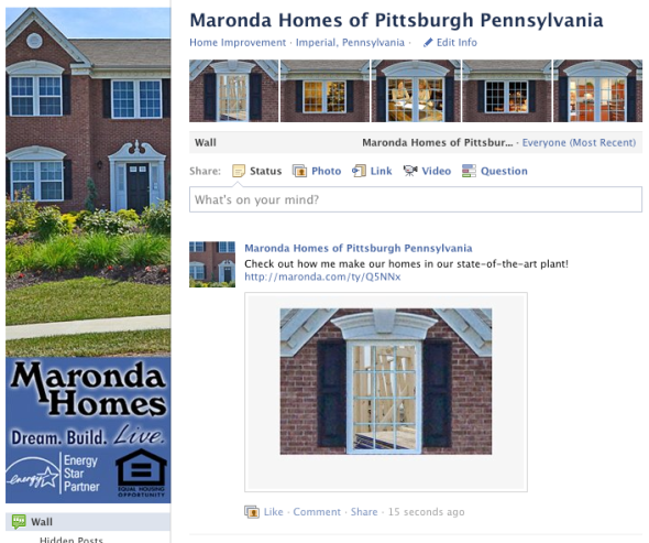
‘Cut-out’ designs like the one above that have been so popular on personal profiles (pre-timeline, of course) are worthless, in other words. Now, what I’ve seen as far as brands dealing with this hasn’t been wonderfully creative. Most seem resigned to just using a bunch of images of their product or designs and letting those fly and some have used five interchangeable images, but none I’ve seen have incorporated the profile picture. After a little brainstorming, I came up with this:
Using standardized window ‘panes’, the 5 potential ribbon photos always make a ‘house’ (mansion might be a better word) with the profile photo.
Using pictures with matching edges for the ribbon, I created the illusion of a ‘house’ incorporating the profile picture with the ribbon photos. Each ribbon image is sized to 98 x 68 px on the profile. The catch is that if the image you want on the ribbon is larger than that, Facebook creates an 98×68 px image ‘preview’, automatically zooming in on the picture and cutting out parts along the edges even if the aspect ratio is identical. After some trial and error, I found it ‘zooms’ in slightly upwards and inwards – I created a frame around where it cuts off the image and placed my content within there. That way, when a user clicks on one of our ribbon photos, they get treated to a full-sized image as opposed to a ribbon-optimized 98 x 68 image. This really opens up the door (pardon the pun) for brands to incorporate more detail into the ribbon photos! The frame itself is colored identically to the lightbox Facebook uses, so without close inspection you don’t even know it’s there. Here’s the frame I used – just place content in the orange space and it will appear in the ribbon.
In our panes, as you might have noticed already, I placed different styles of windows with standardized edges. In each window is a picture that is related to a piece of Maronda content, and the caption has a trackable link to whatever the related content is. I hope to continue populating the gallery until I have a library of different frames, so everyone gets a different ‘house’ when they load the Maronda page. This also gets extra mileage out of older blog entries that might have gotten buried, since a users random ribbon panes will incorporate windows linked to older entries.
What if you don’t have a product with a repeatable element like a window frame? I think the best course of action there is to find an aspect of your brand to use instead. For Pigpen Theater Company, we came up with the idea of a ‘nightmare generator’, putting their signature shadow puppetry creatures in the ribbon. Fans of the theater company were encouraged in the profile picture to create a story using their unique ribbon and writing it on their wall.
I’m curious – what would you do with your brand? Let me know in the comments.
Of course, all of this will be for naught whenever Timeline rolls out for brand pages – I’m looking forward to coming up with some cool designs utilizing that.


